Switch
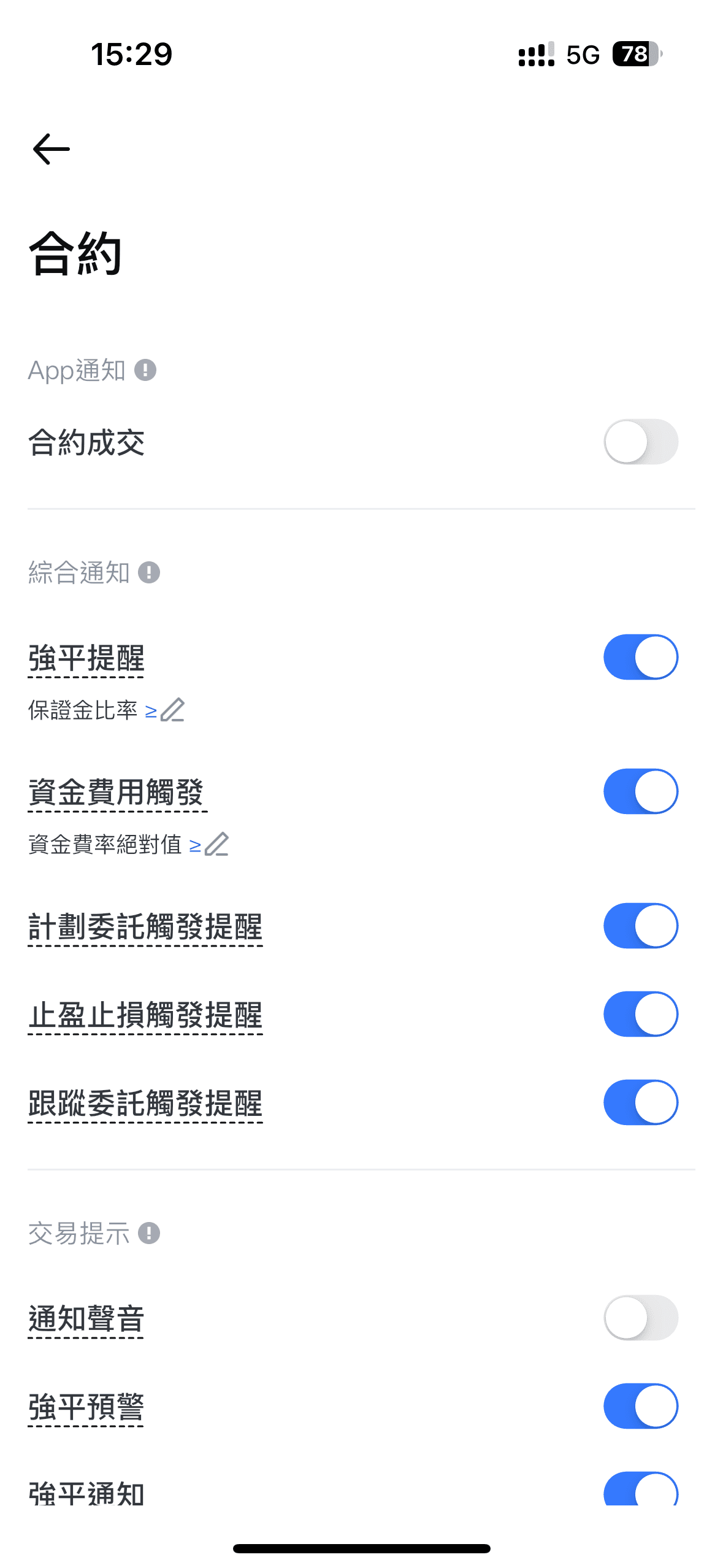
The switch is a component used to toggle between two mutually exclusive states.
Overview

Usage scenario
Use in scenarios where you need to represent an on/off state or switch between only two states, and the action takes effect immediately.
If you need to specify a state that is incomplete or indeterminate, please try using Checkbox.
Specification
Style description
Large size:
Small size:
24px
16px
40px
26px
22px
14 pixels
The switch height is 24px, the width is 40px, the inner circle of the switch is 22px in length and width, and the circle has a common shadow effect (shadow-1).
The switch height is 16px, width is 26px, and the inner circle of the switch has a length, width, and height of 14px, with a generic shadow shadow-1.
Note: The switch component used online is scaled using the native switch component of the mobile operating system, so designers found that the online switch size with decimal points/subpixels is a normal situation during acceptance.
Status:
default:
default disable:
active:
active disable:
Small
Online switch dimensions: 26.11*15.87
Hot zone range: 41*28

Note example

Switch
Toggle Switch
Switch Button
Option Switch
Switcher, Slide Switch