Nav bar
Used for switching or jumping between different pages, located above the content area and below the system status bar.
Anatomy
Title
Title
1
2
4
3
1: Left function button
Optional, up to 2 buttons, usually back, close, or text buttons
2: Container
The container styles itself based on the page background color, with support for business customization.
3: Title
Optional, can be centered or left-aligned, text within 1 line, supports subtitles, suffix text, prefix/suffix icons, and suffix tags
4: Right functional button
Optional, up to 3 buttons including text buttons. If there are more than 3, it is recommended to use '...' to collapse them.
Variant/Type

Usage scenario
Title
9:41
Use when you need to navigate between pages, return to a previous page, or support page-level auxiliary functions.
Label
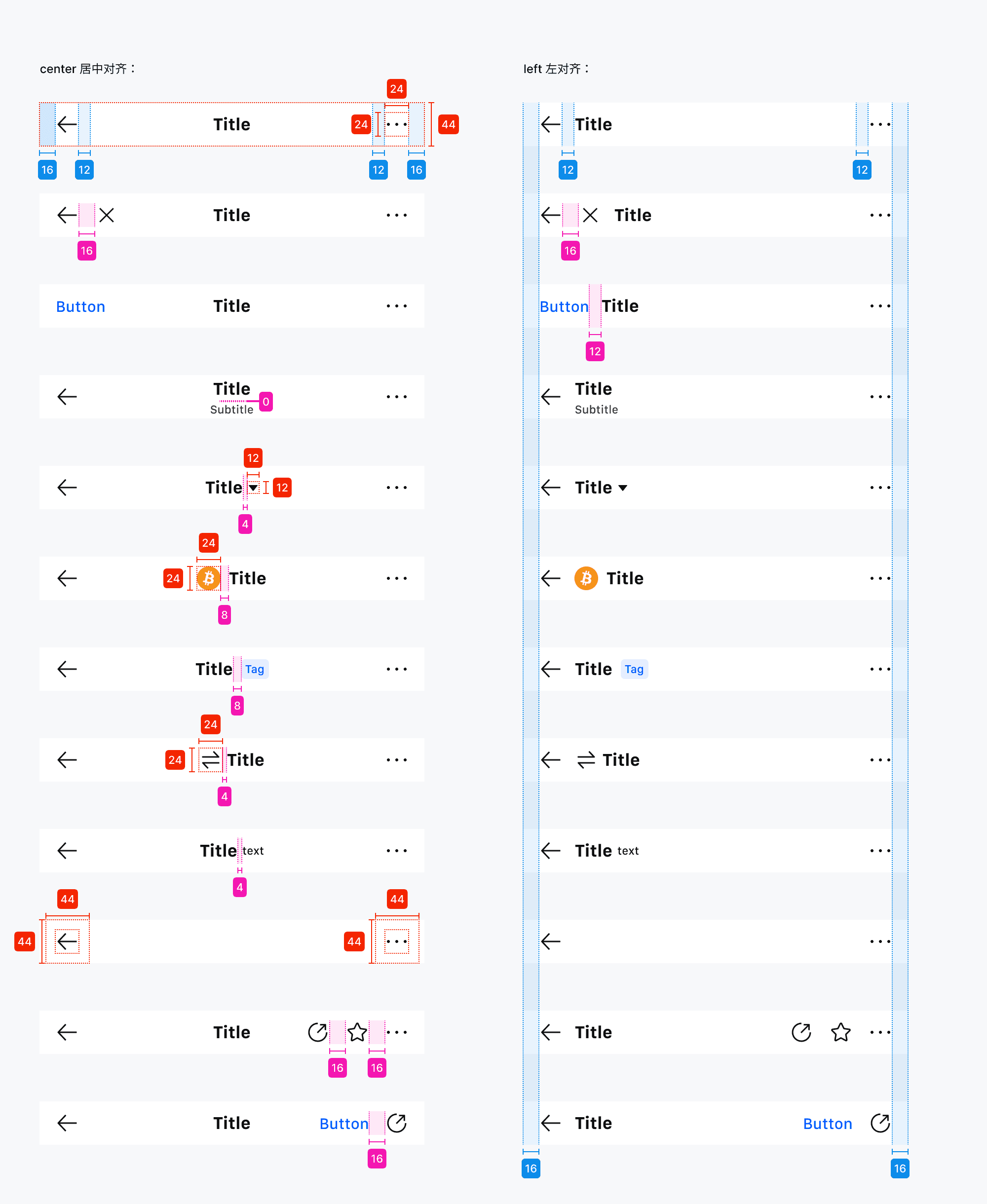
Annotation instructions:
Title 18 Bold, subtitle/suffix copy 12Medium
Left/right function icons, currency pair icons, prefix icons 24*24px, dropdown menu arrow icon 12*12px, left/right function entry clickable hot area 44*44px
The minimum spacing between the title content and the left/right function entry is 12px
Multilingual adaptation
Join MEXC Hot Crypto Chal…
Join MEXC Hot Crypto …
Join MEXC Hot Crypto Challenge...
9:41
Prioritize concise copy, with ultra-long content truncated.
Generally centered, and the navigation bar style should remain consistent within the same business scenario. For non-conventional scenarios, such as when displaying currency names in K-line details where some names are extremely long, centering cannot accommodate the longer names. In such cases, a left-aligned navigation bar can be used, or when the English copy is already very long, left-alignment can be adopted.
RTL
Title
Title
LTR
Title
Title
RTL
Usage
Join MEXC Hot Crypto …
Do
Join MEXC H...
Don't
When the copy is long and there are many entry points, a left-aligned layout is recommended.
Join MEXC
Do
Join MEXC
Don't
In general scenarios, 'Return' and 'Close' should try to appear only one at a time and avoid using them simultaneously.