Layout
Grid and layout are among the fundamental specifications in interface design.
MEXC Design follows the design values of security, trust, continuous progress, and innovation. This document aims to standardize the layout design of App-side products, ensuring visual and functional consistency while providing clear guidelines for designers and developers to reference.
Layout type
Default Grid common page grid
Menu Grid Sidebar Page Grid


Layout parameters and usage methods
The dimensions of the design draft are:
PC - 1440*900px
iPad - 768*1024px
H5 - 390*844px
Responsive breakpoints for web are generally:
PC - Screen width ≥ 1024 or 1248 or 1440
iPad - 768 ≤ Screen width < 1024
H5 - Screen width < 768
The app grid is consistent with the H5 grid.
Usage:
Add the Grid component Token of Foundation Library 4.0 (Beta) in the layout grid on the right side of the Figma properties sidebar.

Note example
The module must be on the grid columns and cannot appear in the gutters.
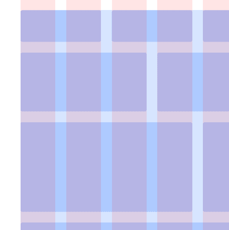
Do

Don't
When it is necessary to accommodate ultra-wide screens such as fish screens, for webpages that include a left navigation bar, it is advisable to use a content area adaptive approach to prevent excessive spacing between the left navigation and the content area.
Do
Don't
Special responsive instructions
Filter - Filtering function. Responsive processing method: Web-PC for multiple selector combinations, iPad sidebar, H5 bottom popup.
Take the Asset - Transfer scenario as an example:
Asset - Transfer - Web - PC, multiple filters
Asset - Transfer - iPad, too many filters to fit, collapsed into a
