Elevation
Basic explanation of the level colors in all types of pages
Instructions for using the color token for app page hierarchy
The page background color starts with bg-L0 pure white/pure black, the primary card color is bg-L1, and the secondary card color is bg-L2.
Level 1
token: bg-L1
Level 0
token: bg-L0
Level 2
token: bg-L2
Color token position:

Regular web page
The background color of functional pages starts with bg-L0-atn gray/pure black, the primary card color is bg-L1-atn, and the secondary card color is bg-L2.
Level 0
token: bg-L0-atn
Level 1
token: bg-L1-atn
1px border: border-card-default
Level 2
token: bg-L2
1px border
border-card-default
The background color of the reading-type page starts with bg-L0 pure white/pure black, the color of the primary card is bg-L1, and the color of the secondary card is bg-L2.
Level 1
token: bg-L1
1px border: border-card-default
Level 0
token: bg-L0
Level 2
token: bg-L2
1px border
border-card-default
Introduction page for the web
Introduction page L0 color token: bg-L0-atn, L1 color token: bg-L1-intro, L2 color token: bg-L2
1px outline: border-card-default
1px outline: border-card-default
1px outline: border-card-other
1px outline: border-card-other
Level 0
token: bg-L0-atn
Level 1
token: bg-L1-intro
Level 2
token: bg-L2
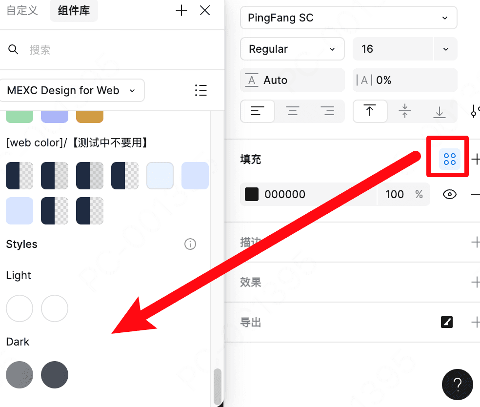
Note: The color of bg-L1-intro is at the bottom of the color component.

Web-based event pages
Introduction page color token L0: bg-L0-atn, color token L1: bg-L1-act, color token L2: bg-L2
1px outline: border-card-default
1px outline: border-card-default
1px outline: border-card-other
1px outline: border-card-other
Level 0
token: bg-L0-atn
Level 1
token: bg-L1-act
Level 2
token: bg-L2
Note: The color of bg-L1-act is at the bottom of the color component.