Modal
The modal dialog is a temporary window that is usually opened in the page to display information or obtain a user's response without interrupting the overall task flow.
Anatomy
Modal Title
计划的佣金操作存在一定风险;建议在使用前阅读用户说明,并仔细核实交易数据。
Checkbox
Secondary
Primary
1
5
2
3
4
1: Title
Optional, icons can be added later
2: Close button
Optional
3: Main text
Must have, when the maximum height is triggered, the content area can be scrolled.
4: checkbox
Optional, can scroll with the content area
5: footer
Optional, usually a button group
1: Title
Optional, with info at the back
2: Close button
Optional
3: Custom area
There must be specific content passed in based on business requirements (including but not limited to text descriptions, forms, tables, step indicators, notifications, filter components, or custom module cards and other custom styles).
4: Main text
Optional, can scroll with the content area
5: checkbox
Optional, can scroll with the content area
6: footer
Optional, usually a button group
7: Placeholder image
Optional, defaults to the status icon, can change according to requirements, and businesses can also provide custom styles. When the placeholder is enabled, the top title must be hidden.
Modal Title
❖
Replace me
计划的佣金操作存在一定风险;建议在使用前阅读用户说明,并仔细核实交易数据。
Checkbox
Secondary
Primary
Modal Title
❖
Replace me
Secondary
Primary
Text Modal pure text dialog:
Slot Modal Custom Popup:
1
2
3
4
6
7
5

Usage scenario
Modal Title
计划的佣金操作存在一定风险;建议在使用前阅读用户说明,并仔细核实交易数据。
Secondary
Primary
Modal Title
❖
Replace me
Secondary
Primary
Type description:
When to use text-only popups:
Requesting immediate user response
Notifying users of urgent information
Confirming user decisions
When to use custom popups:
When plain text cannot support the style required for the needs
For feature introductions, guides, operations, feedback, etc.

Layout adaptation
Modal Title
计划的佣金操作存在一定风险;建议在使用前阅读用户说明,并仔细核实交易数据。
Secondary
Primary
24px
Modal Title
计划的佣金操作存在一定风险;建议在使用前阅读用户说明,并仔细核实交易数据。
Secondary
Primary
80%
Modal Title
The "planned commission" operation carries certain risks; it is advisable to read the user instructions before use and carefully verify the transaction data.
Secondary
Primary
Modal Title
❖
Replace me
Secondary
Primary
Modal Title
❖
Replace me
Secondary
Primary
Type description:
The popup is centered on the page by default.
Some scenarios support top alignment, with a distance of 24px from the top of the page.
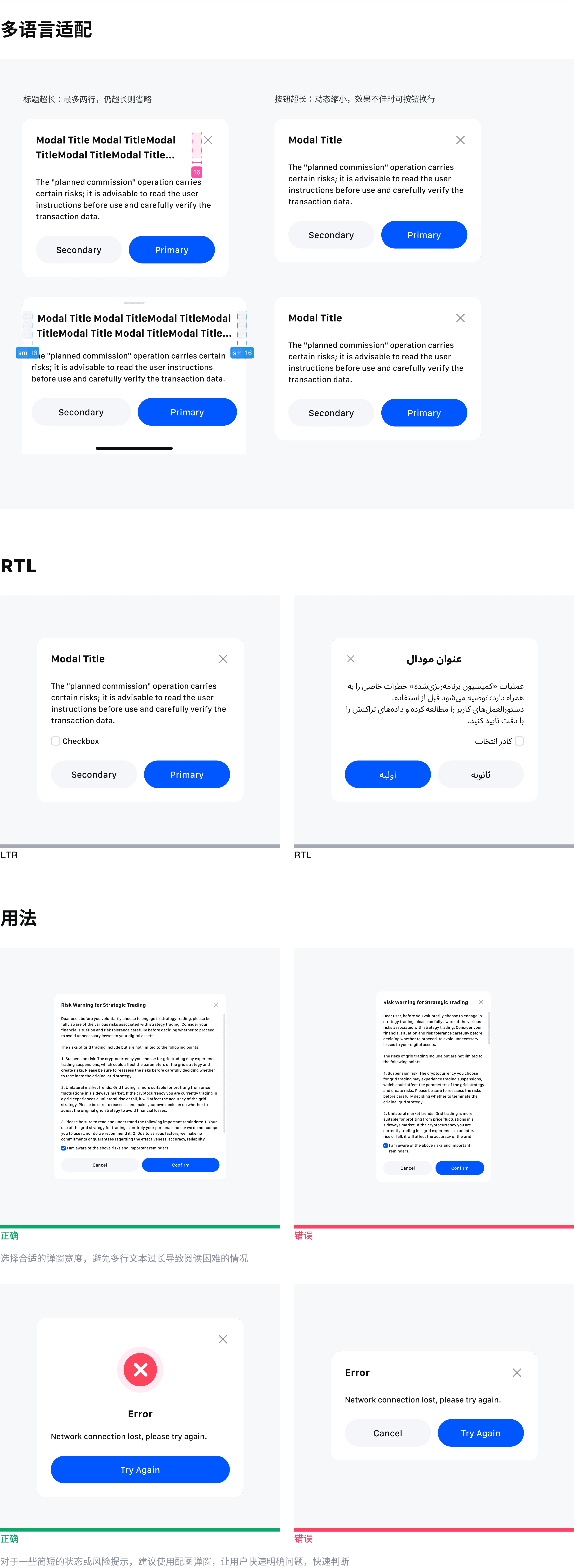
The maximum height of the popup is 80% of the page height; if it exceeds this, the content area will scroll vertically, but not horizontally.
When the screen width is less than 768, it needs to adapt to the H5 style. The bottom popup can be manually swiped down to close. If the swipe-down height is less than half the height of the popup, the popup will not close when it bounces back. If the swipe-down height exceeds half the height of the popup, the popup will close directly.